
Subject guide
Introduction to Digital Humanities
Introduction
Digital Humanities (DH) is a new and rapidly developing field of research that uses digital tools and techniques to analyse digital or digitised sources. Among those turning to DH are historians, linguists, philosophers and anthropologists, who find that digital tools help them to process larger amounts of data in a more systematic manner. Although DH often demands a high level of computer literacy, there are also tools that can be used without much prior knowledge.
This subject guide attempts to help beginners find their way in this fascinating new field. We introduce a number of DH methods, such as data visualisation and network analysis, text mining and data mapping, and present a selection of easy-to-use tools that you can integrate in your own research.
Specialised knowledge and support can be provided by Leiden’s Centre for Digital Scholarship, which offers courses, advice, and help to enable researchers to try out new methods and techniques. For questions relating to this subject guide, you can contact the Libraries’ subject librarians.
Data Visualisation and Network Analysis
Data visualisation refers to the graphical representation of information with visual elements such as charts, graphs, and maps. Data visualisation tools provide an easy way to represent and understand trends and patterns in data from all kinds of sources. This is closely related to network analysis: the visualisation of connections between actors, groups or things.
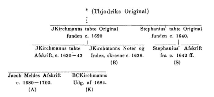
Using visual aids to present scholarly research results is not new. In research on European medieval manuscripts, for example, stemmas, or family trees, have been used for centuries to show the relationships between different versions of a text found in different manuscripts.
New tools, however, combine data from all kinds of sources and produce interactive visualisations that go beyond the mere presentation of scholarly results. Data visualisations provide insight into large amounts or complex data that more traditional techniques cannot yield. Very simple visualisations like pie charts or column charts can be made with spreadsheet programmes like Microsoft Excel.
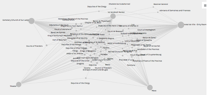
Tool: Palladio
Palladio is software for the visualization of complex, multidimensional data. It was developed in the framework of the project Mapping the Republic of Letters at Stanford University. In this project social networks between were charted based on the correspondence between scholars in the 15th to the 18th century.
Palladio is relatively easy to use; you can upload your data in an appropriate tabular format (for example .csv or .tab) at the website and start analysing and visualizing there. If your data contain coordinates, you can present them into a map with Map View. Other types of relationships can be visualized with Graph View:
When working with Palladio or other visualization software, you will often experience that your input data contain[s] inconsistencies. There is software that can help you to filter these out, like Google’s Open Refine.
Project Example 1: East India Company Database
Sourced from the India Office Records from the British Library, the East India Company database consists of documents related to the East India Company. Containing royal charters, trading diaries, minutes of council meetings and reports of expeditions, this resource charts the history of British trade and rule in the South and Southeast Asia and beyond from 1599 to 1947.
The database offers an interactive visualisation of the East India Company’s trade between 1760 and 1834, based on data from the archival sources. This extra feature is a valuable aide for users to gain insight into this complex part of British history.
By manipulating the map, line graph and sparklines – small line charts without axes or coordinates – one can select markets, commodities and date ranges to explore.
This database can be found here, and be accessed via the Leiden University Library here. A brief introductory video can be viewed here.
Project Example 2: Trans-Atlantic Slave Trade Database
The Trans-Atlantic Slave Trade Database contains information on 36,000 individual slaving expeditions between 1514 and 1866. The records of the voyages have been found in archives and libraries throughout the Atlantic world. They provide information about vessels, routes, and the people associated with them, both enslaved and enslavers.
The database raises questions about the largest slave trades in history and offers access to the documentation available to answer them. Various forms of data visualisation are used to present the data in ways that enable easy analysis of the data: statistical tables, graphs, maps, and a time-lapse which provides a chronological overview of the movement of 31,166 slave ships on their journey across the Atlantic Ocean. By manipulating the timeline, trends in Trans-Atlantic slave trade become visible.
On this website you will find data visualisations and time-lapses.
Mapping and Geographic Information Systems
A map can be an effective way to visualise how people or communities interact or are related to each other. Mapping data is especially effective for visualising spatial information and information on human networks. Data visualisation, network analysis and mapping are thus closely related.
Digital tools can be used to create static or interactive maps, which can aid both researchers and their audiences in the interpretation of their data.
Mapping can refer to simple actions such as pinning locations on a digital map, or to visualising complex interactions between many actors. See for inspiring examples the various mapping projects of Dutch history via HisGis, and the blog Anterotesis for a sample of international history mapping projects.
Tool: Nodegoat
Nodegoat is a free tool that allows researchers to analyse and visualise their data through networks, time and space. You can build your own database and show how persons, objects or events are related both spatially and chronologically. You can make use of custom (historical) maps in your geographical visualisations. Furthermore, you can easily export your data in various file formats and create interactive maps of your data that can be viewed and used by others.
Each object that you register can be supplemented with geographical and temporal attributes, thus enabling diachronic geographic and social visualisations. All objects are treated as equal and hierarchy depends on the links between the objects. Nodegoat is easy to use and offers user guides through videos and websites.
See Youtube for video tutorials on Nodegoat. The Nodegoat website provides an overview of various research projects using the tool.
Project Example: ORBIS The Stanford Geospatial Network of the Roman World
ORBIS reconstructs the travel networks and different types of travel in the ancient world. The platform is based on a simplified version of the giant network of cities, roads, rivers and sea lanes that framed movement across the Roman Empire. It broadly reflects conditions around 200 CE, but also covers a few sites and roads created in late antiquity.
ORBIS allows a user to determine the cost, time, and distance of various land, sea, and river routes among hundreds of sites in the ancient world. The platform can among other be used to study trade and travel routes.
See Youtube for a video tutorial on ORBIS.
Text Mining
Text mining is the semi-automatic or automatic analysis of large quantities of text to extract new information or previously unknown patterns. In essence, it revolves around quantifying the occurrence of words, or combinations of words in large sets of text. This type of research is flourishing, because ever more texts are available in digital form.
Text mining can lead to fascinating insights. The appearance and disappearance of certain words (or combinations of words) in newspapers can provide historians with clues about changing public opinions on all kinds of issues. Quantifying the relationships between certain words can also help to determine an author’s usage of grammar and style, and so make educated guesses about the authorship of texts.
Text mining can be highly advanced, but there are also tools that are easy to use. And although software is a central aspect of text mining, it is not the computer who does the research: asking the right questions and interpreting the outcomes is still the work of human beings.
Tool 1: Gale Digital Scholar Lab
The Gale Digital Scholar Lab is a cloud-based platform that enables you to create, analyse and visualise data sets. It offers ready-to-use tools, such as an Ngrams maker, a sentiment analysis tool and a topic modelling tool. The platform’s Learning Centre provides help in the form of videos and instructions to help you set up your own research.
The Lab enables you to analyse data sets in three steps: build, clean, analyse. First, you build your own content set, by selecting texts from Gale’s Primary Sources collection, or by uploading your own corpus of sources. Then you clean the content set by automatically removing white spaces, stop words and/or special characters. In the third step, you can use Gale’s tools to run various analyses on your selection.
Purdue Libraries made a brief video tutorial on the Gale Digital Scholar Lab. Official tutorials can be found in Gale’s Learning Centre, which can be accessed after logging in to Gale Digital Scholar Lab.
Tool 2: Voyant
Voyant is an open-source and easy to use web-based application for performing text analysis. It allows you to analyse individual texts as well as entire text corpora. Frequencies of words and word combinations can easily be represented in charts and other visually attractive ways.
Starting with Voyant is straightforward: you can upload your text files into the website or select a pre-existing corpus, such as the plays of Shakespeare, and you will immediately see an interactive dashboard. This dashboard shows you key information about the corpus, such as vocabulary density and the most frequent words, and gives you various tools that you can use for analysis.
See Youtube for video tutorials on Voyant, such as How to get started with Voyant Tools and Voyant Tools Tutorial. Voyant also offers tutorials on its website.
Text Encoding and Enrichment
Text Encoding and Enrichment are central aspects of DH. Encoding refers to the addition of codes to (parts of) digital or digitised text. For example, key terms in a text can be enriched with links to pages that explain the meaning and background of the terms.
Various platforms provide access to enriched texts or even provide users to create their own corpus and enrich the texts included in it.
Tool: FromThePage
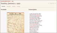
FromThePage is an easy-to-use platform is designed for transcribing documents and collaborating on transcriptions with others. You can upload PDFs and pictures, or directly import documents from a digital library. Subsequently, you can edit the text or add notes or annotations. It is also possible to index a document by tagging people, places and other topics.
For examples of projects using this tool take a look at the site's Find a Project.
Project Example: Perseus Digital Library
A well-known example of a platform with enriched texts is the Perseus Digital Library. This website contains hundreds of classical texts, mainly in Ancient Greek and Latin. Readers can click on every individual word in these texts and get a hint as to the translation. It is also possible to read the corresponding entrees in the Dictionaries of Lewis and Short (for Latin) of Slater (for Greek) and look for other instances of this word in other texts. The platform is based on the Text Encoding Initiative (TEI) tool.
Digital Image Research
In the past twenty years, digitisation of historical images has made great progress. Take a look at out subject guide Searching and Using Images for a number of image databases. Leiden University Library has digitised a part of its Special Collections, including photographs, drawings, paintings and manuscripts, which can be found in the database Digital Collections. However, there are many more image databases, such as the Ad*Access database, that contains over 7,000 digitised U.S. and Canadian advertisements from the period 1911-1950.
Scholars also develop computer programs to analyse large collections of digital images. Computer programs can search immense numbers of images for patterns and trends. Such research requires the creation of both datasets and tailored software. When both are created, however, other researchers can also use them.
Tool 1: Siamese
SIAMESE is both a tool and a database that can track visual trends in advertisements. It is based on a dataset of 426,777 advertisements in two Dutch newspapers for the period 1945 – 1994. You can submit a specific newspaper advert and subsequently see whether this advert was part of an identifiable visual style, and if so, how that style developed over time.
The developers also published the article The visual digital turn: Using neural networks to study historical images explaining the software and its usability.
Tool 2 - ImagePlot
ImagePlot is a Cultural Analytics method for researching images, developed by the Software Studies Initiative. This tool combines digital image processing with a new type of visualisation. The ImagePlot tool automatically registers various features of an image (such as hue, saturation, brightness, contrast etc.) and subsequently allows a researcher to make plots and graphs that show the patterns and relations between these features.
As an example, they analysed and compared one million pages from Japanese manga comics and were able to show the difference between manga series and the development of styles within manga series over time. Other researchers used ImagePlot to compare the differences between the top 100 bestselling books from 13 different countries.
See Youtube for video demos and tutorials. A full manual can be found on the blog Expanded Storytelling.
Web-based applications and intellectual property
Digital Humanities aims to enable and stimulate collaborative and interdisciplinary research. However, keep in mind that when you use a web-based application like Palladio or Voyant, your data and results might be available to the developers and the organisation behind the tool. Especially when using data that need careful handling, for example because of privacy issues, this is an issue that requires extra attention.
You can contact the Leiden Centre for Digital Scholarship for advice on these and other issues of data management. The Centre regularly offers training, events and presentations on different aspects of digital scholarship.
The Leiden University Centre for Digital Humanities is an interdisciplinary centre for the study of human culture using computational approaches. It offers a Digital Humanities Minor.